15 Design Decisions That Annoy Readers addresses one of my pet peeves.
Snap Shots allow a reader to view a website’s design by simply hovering over a link. The feature is annoying for several reasons:
- Readers have no choice in the matter. Now a reader can opt-out. Opting out still sucks, however.
- Snap Shots are obtrusive.
- Snap Shots are arguably unnecessary. What is the value of knowing what a blogger’s site looks like anyway?
Please oh please oh please, if you have Snap Shots on your blog, turn them OFF. I hate it that WordPress.com has Snap Shots enabled as the default (and doesn’t allow readers to opt out, either I was wrong, actually readers can opt out on WordPress.com.). If you have a WordPress.com blog and haven’t sussed out how to turn them off, here’s where to go on your Admin Dashboard.
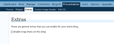
Just uncheck that box exactly like I have it there, then click on the UPDATE EXTRAS button, and they’ll be gone.
Bliss.
Categories: technology
 Link OTD: DIY Feminist Cybersecurity
  For those times when actually blocking someone on FB is socially awkward
  Unhappy data retention day
Oh my yes. Yes yes yes yes yes. Who invented this abomination, and can we confiscate hir computers now plz?
The instructions on disabling them on an eljay are here.
I just found this at the snap.com site. It claims to set a browser cookie that turns all Snap previews off. I just tested it with Shapely Prose, and it seems to work.
p.s. I have to agree on the dark backgrounds, too. Never met one I preferred over a white/very pale background. They’re tiring and difficult to read.
Lauredhel’s last blog post..Neale Fong and Jim McGinty: the plot thickens.
Hmm, I am annoying I think.
I’m unlikely to change the dark background but I guess I could be a little less anoying and turn off the snap shot thingy.
I’ll take this under advisement.
blue milk’s last blog post..Work and Family (Im)Balance: findings from OECD countries
I usually have to dial up the font on your site to read, blue, but it’s worth it (and I read your posts in glorious black-on-white in my feed reader anyhow).
I might find it a bit easier to read if the grey text was a little lighter?
Lauredhel’s last blog post..Neale Fong and Jim McGinty: the plot thickens.
End-users can turn off the functionality on their (client) end: Just click the Options (cog-wheel) icon in the upper right corner of the Snap Shot and disable for “this site” or “all sites”.
A lot of people LOVE this functionality. Before you decide which camp you are in, you should know that there’s a little more to it than “previews”…
Cheers.
–
erik.at.snap.dot.com
ooh, good call on disabling the snapshots. as a newbie blogger, i know nothing about such things, so thanks for the heads up!
ladoctorita’s last blog post..food for thought #2
I don’t know if snap preview annoys me, I guess only if it doesn’t disappear immediately when I move the cursor away from the link.
One thing I absolutely disagree about is the dark background.
This is truly an irrational peeve. Blogs aren’t printed on paper, no black ink is wasted, so black is niiiiice.White backgrounds waste a lot of energy and are bad for your computer’s display. If you’re not filthy rich and totally indifferent to unnecessary usage of electric energy, you’ll like your nice, dark background which is, in addition, easier on your eyes.
I dislike tiny fonts, so I played with the font size on my blog to make reading more humane.
Cheers, everyone.
Januaries’s last blog post..Smart. But Not Too Smart to Be a Lady
Erik, I admit, when I first saw them I was impressed, but I’m so over it, because they pop up everywhere in link-heavy text. I can see the point of SS on sites for dating/gamers/finance etc, where it brings up a nice little profile of a person or chart or weapon. That is a useful functionality.
But they don’t add anything at all to blogging generally. Especially not the sort of blogs I mostly read, which tend to have longer articles making detailed arguments. They are obtrusive.
Now, if there was a custom field to add to links that added a class of SS just to that link, so that people could use them sparingly for impact, it would make a world of difference. But having to enable/disable SS for an entire site limits it, and forgive me, the options button up at the top is not at all obvious. Thanks for letting me know about it though.
Januaries, I don’t mind dark backgrounds where the text is sufficiently contrasted. Too many people go for a muted grey on black approach though, presumably because it looks elegant. That’s fine for a photoblog, but it doesn’t work that well with text-heavy sites.
Erik’s right. It is easy to disable snaphots from a user end. I’VE DONE IT SEVERAL TIMES AND IT KEEPS COMING BACK. I know I’m doing it properly because it goes away for a few weeks. But then it comes back like a, a, really annoying computer function.
I think that I’m officially not annoying! This is a first!
Cara’s last blog post..Offensive Remark of the Week: Sometimes You Gotta Smack Up the Bitches Edition
Kate, I just had that happen to me. I disabled SS for one site and refreshed that window, and SS were gone. I went back an hour later (having left the tab open) and the SS were back!
Cara, do you think you need a badge to mark the occasion?
Except that it’s not. It may be easier on your eyes – I have no way of knowing that – but it isn’t easier on my eye/brain complex at all. I have trouble adjusting to reading black-background blogs. They take longer for me to read. I find myself adjusting my glasses as the words are swimming around on the screen. I often have to turn up the font to make it easier (even with high-contrast white on black).
I don’t think my laptop LCD uses much electricity compared to the usual CRT screens. It’s certainly a drop in the ocean compared to what I’m using in air-conditioning this horrible summer.
Agree on the Snap Shots. Just because we have the technology doesn’t mean we should use it.
But the worst is black backgrounds. I simply do not read them. As soon as I see the blog is black I close the tab.
The power the black background saves, and it’s only on old screens not the new flat ones, will pale into insignificance when compared to my optometrist bill if I waste my time trying to find the grey/white letters.
Australian Atheist’s last blog post..Conversational cruelty
Another quick link: 50 Tips to Unclutter your blog
I’ve implemented a few of Skellie’s recommendations myself, for a leaner, cleaner sidebar.
I think you’ve cleaned it up well but I disagree with this:
10. Put your blogroll on a separate page.
It makes me much less likely to visit blogs on your blogroll and I think it’s a bit rude (not the right word but close) to people who have your blog on their front page blogroll. Maybe it’s just me though.
Australian Atheist’s last blog post..Conversational cruelty
I’m in two minds on the blogroll question. When I first started visiting blogs I perused blogrolls avidly, but for the last year or so not so much.
So it’s a question of whether one caters to one’s longterm regular vistors, who appreciate a leaner sidebar, over the newbies who might be more used to it all on the front page. Will most newbies really not follow a clear link in the sidebar to a blogroll? I don’t know.
If anybody’s got some links to studies on this, I’d appreciate knowing of them.
Found the perfect plugin to resolve the blogroll issue – a random selection widget for the sidebar, which displays a list of 10 blogs from the full blogroll, and changes every time the page is refreshed. I knew they were around, I’ve seen them on other blogs, I just had to figure out which one was the right one.
I’ve gone with Better Blogroll by John Dyer.
Better Blogroll: I like it.
Lauredhel’s last blog post..Pop quiz: Women in Parliament